-
Architects: Henkin Shavit Architecture & Design
- Area: 200 m²
- Year: 2014
-
Photographs:Yoav Gurin

Text description provided by the architects. The project is planning a residential unit in a continuing generation neighborhood, planned as an extension to the kibbutz located in the northern part of the Israeli coastal strip adjacent to the Mediterranean Sea. The semi-detached house was the chosen model out of a number of models presented to the customer. The selected model was not designed for a specific customer; it is trying to answer an anonymous architectural program.

The "Henkin Shavit" studio, headed by Irit Henkin and Zohar Shavit, conducted the planning and design of the project, with their vast experience managed in a relatively short period of time, to run this project with an emphasis on key elements in interior design. The project dealt with the issue of a makeover from an anonymous residential unit of 200 sq meters to a personal and specific residential unit that responds to the needs and loves of a young couple in transition for a small family.

The home owner who was born in the city of Nahariya and her husband, who was born and raised in the kibbutz, set a challenging architectural program which contains natural contemporary materials, large spacious spaces, especially stressed the need for a public space that will accommodate their many friends in comfort and fun.

The program chosen by the studio for downstairs is a living room and kitchen, adjacent to a front yard, a guest accommodation unit, office, guest bathroom and utility room. The master bedroom was placed in the second floor and adjacent to it is an open studio space towards the stair hall, which operates as a flexible space that can be altered in accordance with the future family needs.

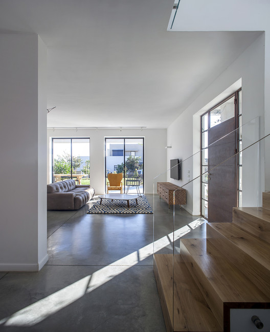
The foyer is designed to be the largest space in the house and contains the kitchen, which was designed as a system containing a combination of storage element adjacent to a white painted wall, integrated in the surrounding walls. The work isle is stretched along the entire space and combines the dining area. The work triangle is formed by the sink, stove and a free standing oven all located at the working isle and between the built-in Subzero refrigerator in the high storage unit. Natural oak is the material chosen for the work isle and dining area, with drawer fronts designed with three-layered Goshen oak which allowed for some wood to be removed and locating black handles in that space. The wall facing the front garden contains 3 identical openings which combine a Belgian profile made of steel with black oil paint finish. These windows have been designed with minimum distributions in a method of only an external frame profile.

The main entrance door was designed from the same profile only that it was burned with acid, creating a natural look of rust. The home's floor is cast in smoothed concrete with a light, natural shade, which was slotted in only a few divisions. The toilets and showers were designed in a classic look that combines mosaics, illustrated concrete tiles, glossy white ceramic walls and the sinks' carpentry was planned from Goshen oak wood with lacquer finish and specially made brass handles were attached to it. The furniture surfaces in the wet areas and the kitchen are Caesar Stone, in a light shade and gray veins. The staircase was covered in 2 inch Goshen oak and the banister was designed from a clear glass unit.

The top floor was designed to preserve the building's slope tiled roof structure. This slope ceiling was covered from the inside by male-female 33mm oak boards which were painted in shiny white finish. The master bedroom is planned as a spacious loft and contains a sleeping area, wardrobe space, make-up unit, shower and toilet.

The materials in the house contain a combination of natural oak with gray and black shaded concrete, joined by black and rusty iron and sand sprinkled transparent glass. The colors contain a scale of black, gray, pale blue, white, joined by textures and finish ranging from shiny to mat and from smooth to the raw and rough. The house is scattered with artifacts and photographs, also, design elements and furniture from the best design brands.

Finally ... the result in front of you - an "island" of design, beauty and personal taste in the texture of continuing generation in the Israeli kibbutz.


